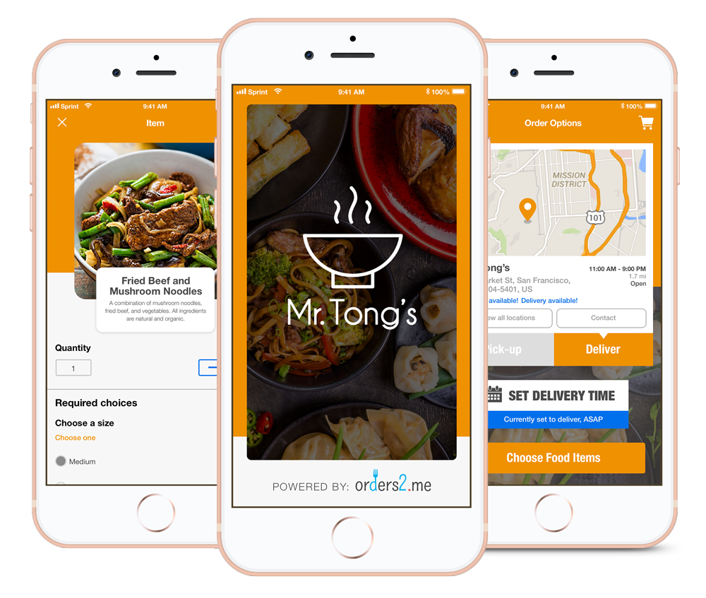
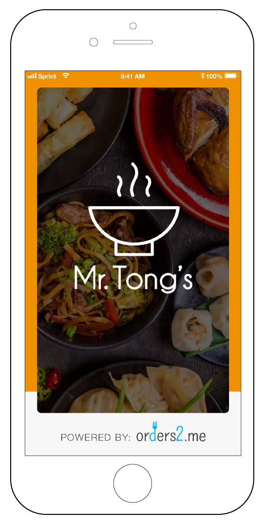
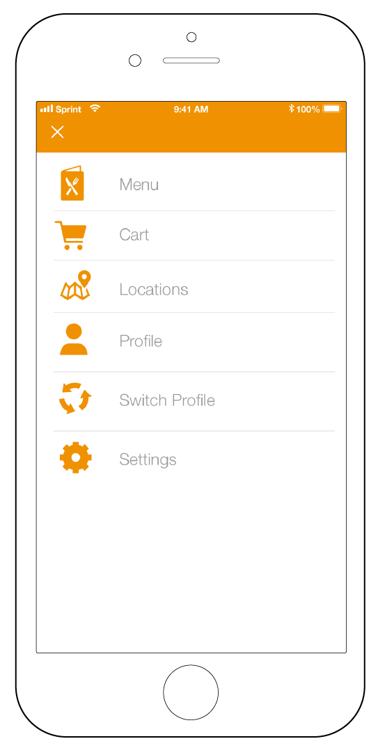
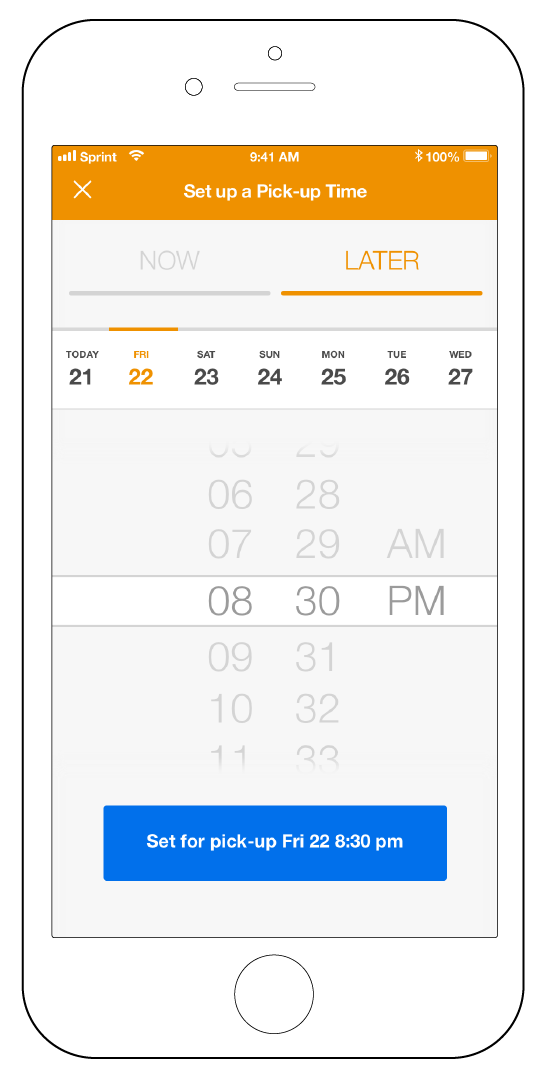
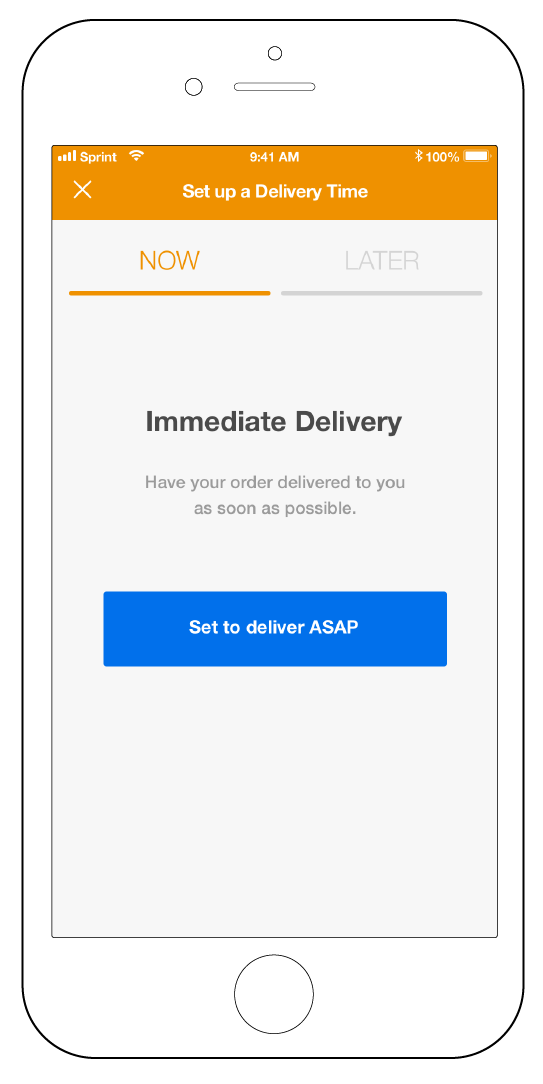
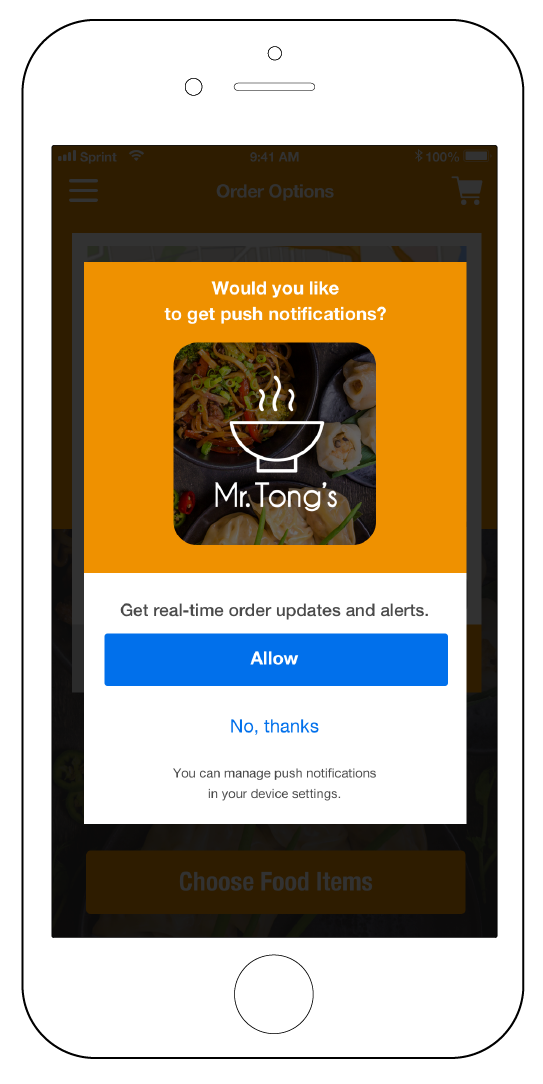
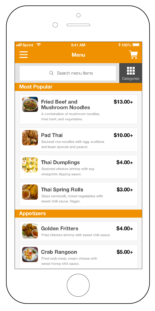
Orders2me is a mobile product that provides pre-built templates for restaurants to build their own personal mobile food delivery app, specifically just for them.
Orders2me
iOS Mobile App
Overview
Team
Justin de los Angeles
Development Team
Orders2me Development Team
Role
Product Designer
Initial Problem
Orders2me as a team, had already done extensive research, gathered user needs, and created user stories based on their research. The team already had the needed data, but needed a way to convert that data into a tangible product and solution.
Goal
The objective was to synthesis the research, determine what solutions needed to be done, and then design the hi-fidelity design for their mobile app. What makes Orders2me different, is that unlike Grubhub or Seamless, Orders2me allows restaurants to build their own custom delivery app, specifically catered just for their restaurant. The goal was to create a design template that was adaptable enough for multiple restaurants to be able to create their own custom online ordering experience.
UX Process and Methods

Competitor Analysis
Due to the user stories being complete, the next step for me was to do a competitor analysis, in order to get a broad view of the food delivery service landscape. The competitors that I conducted an analysis on were ChowNow, Seamless, UberEats, Postmates, and Grubhub. The analysis helped to uncover current features, strengths, weaknesses, along with ways that Orders2me could differentiate from its competitors, and existing methods of solving current user needs.

User Stories
The specific features that were targeted during the competitor analysis, were based on the user needs of the existing user stories.
Hi-fidelity wireframes
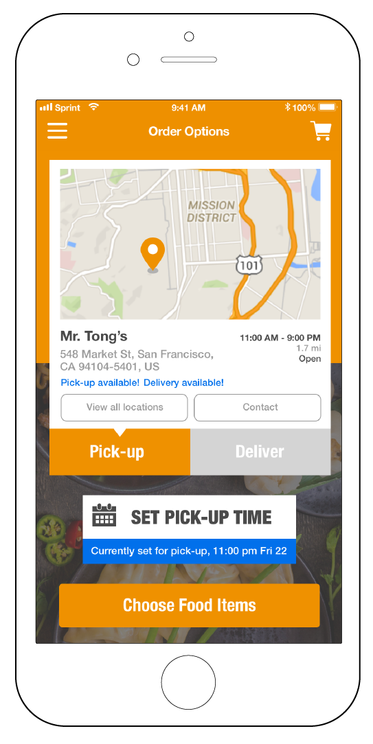
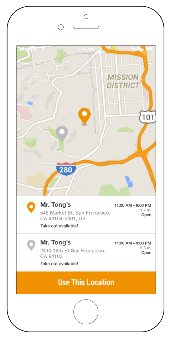
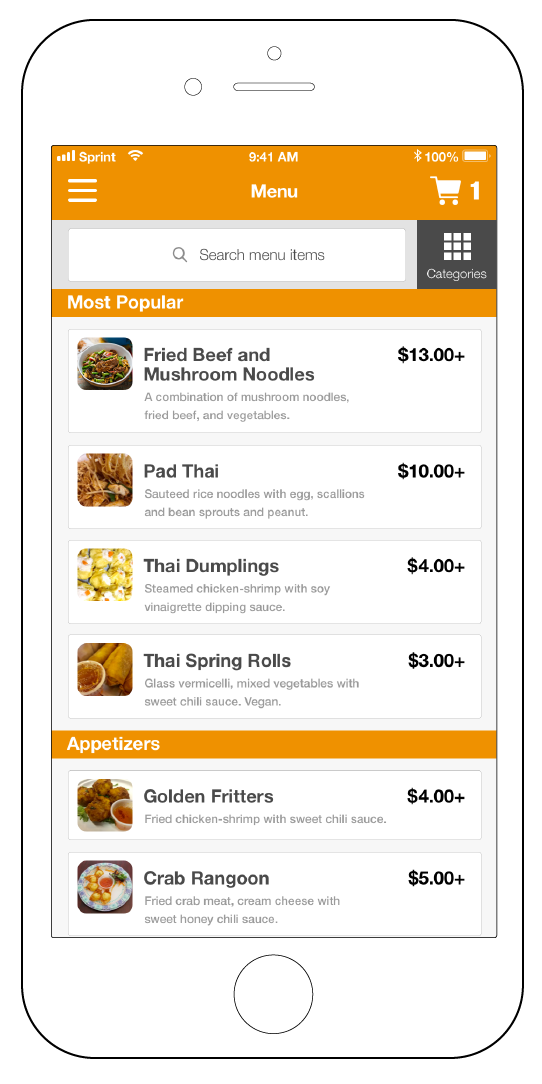
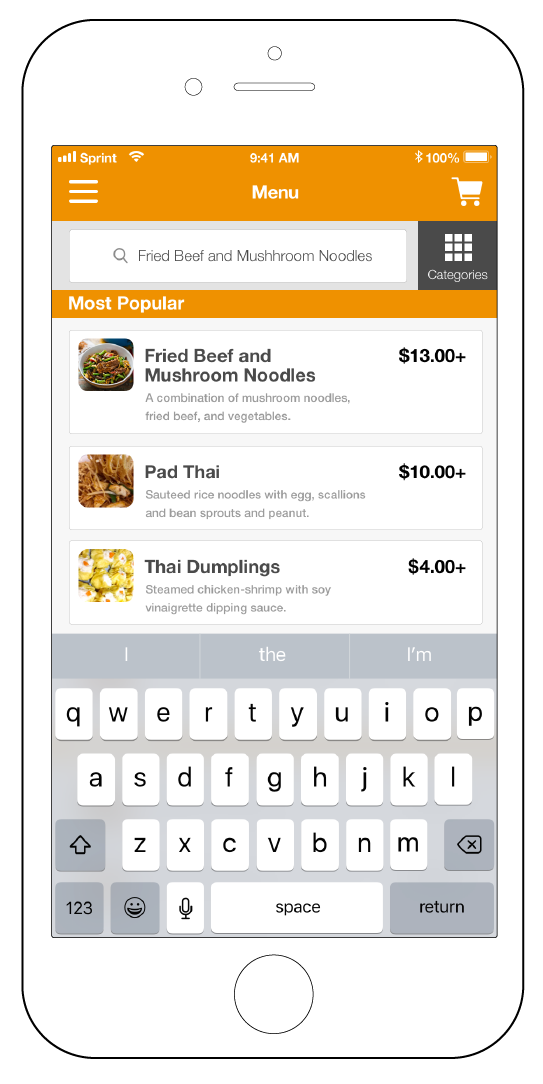
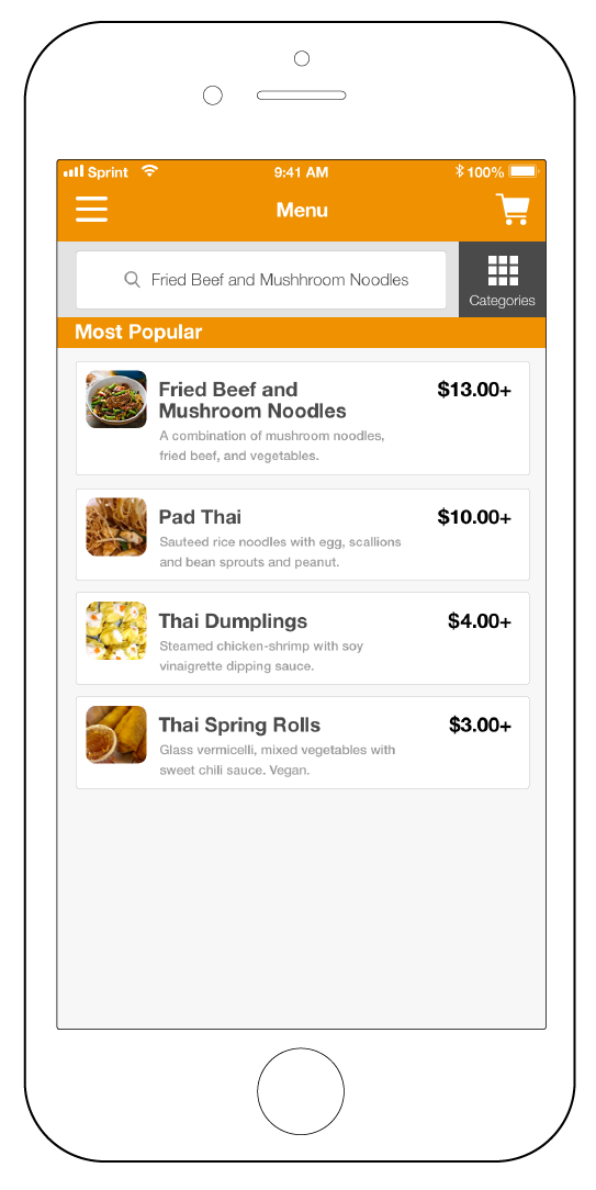
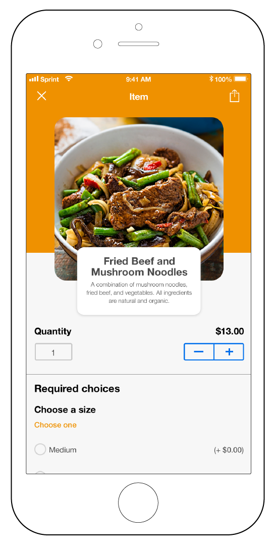
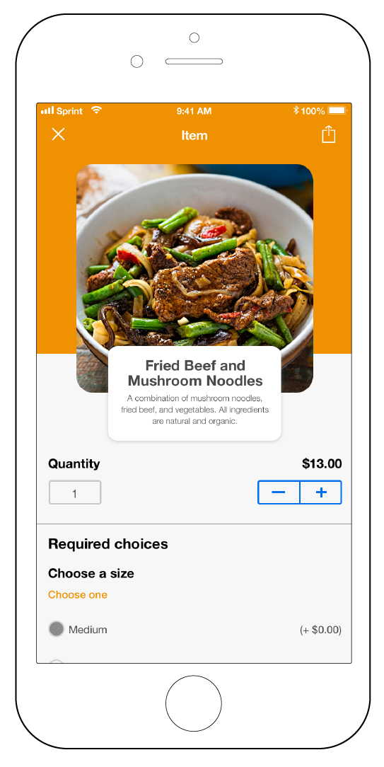
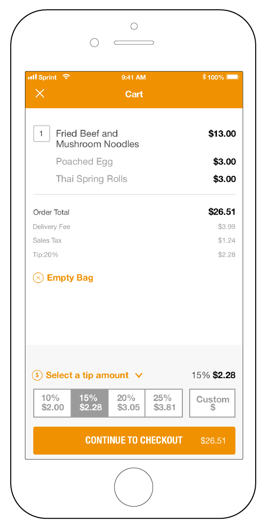
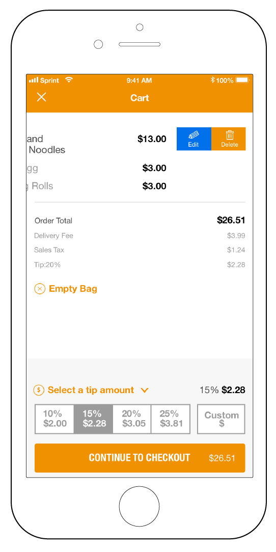
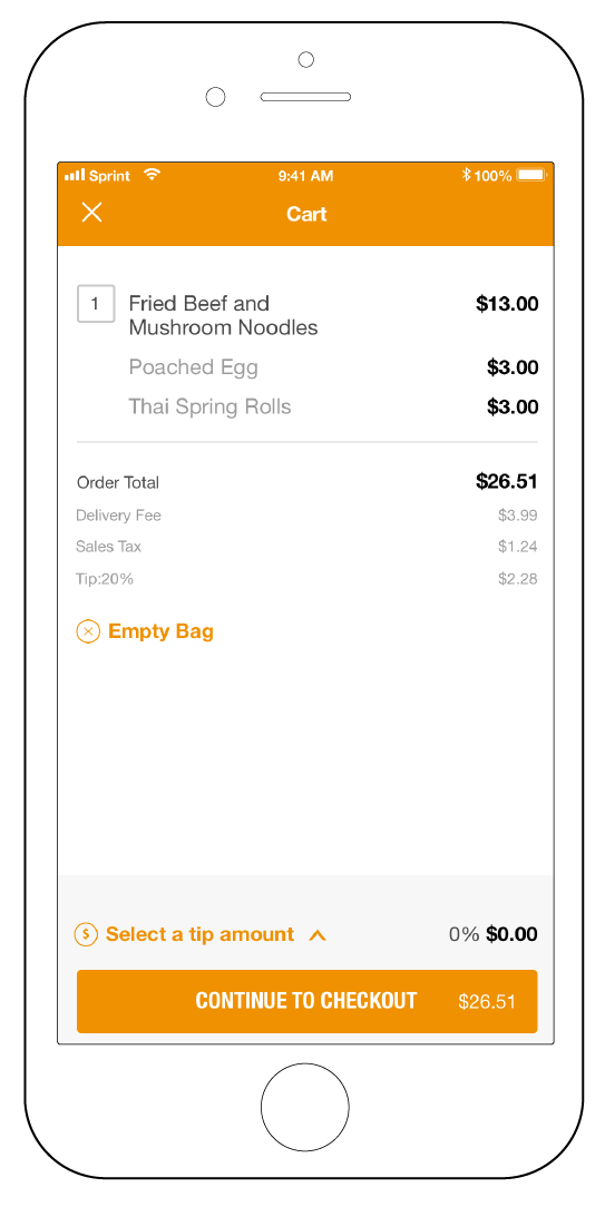
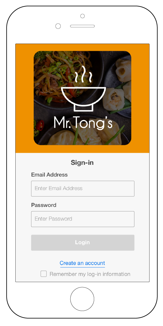
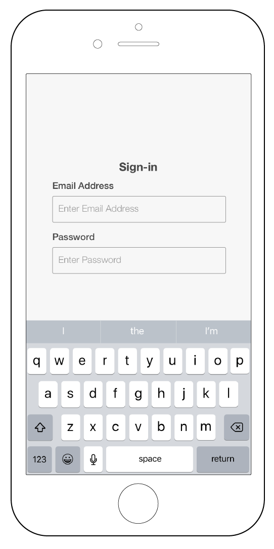
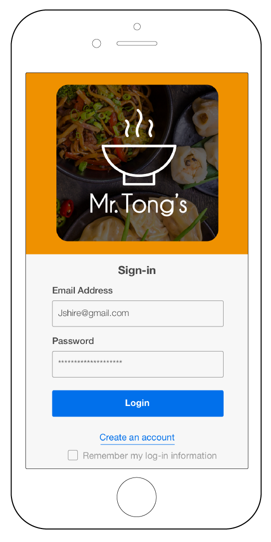
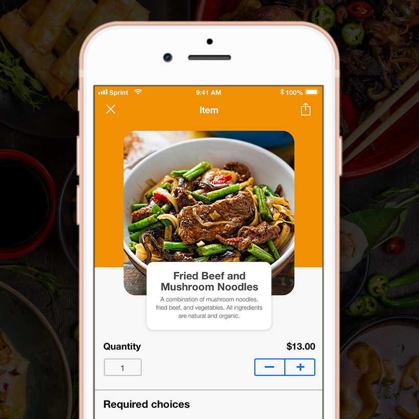
The hi-fidelity wireframes had a high success rate, with 3 out of 4 people, able to successfully complete both task scenarios with minimal issues. A big purpose for the new hi-fidelity wireframes were to make them template based, so that the design could be easily customizable, to fit the needs of any restaurant.
Usability Testing Results
The task I gave to the testers, was to purchase a bowl of Fried Beef and Mushroom Noodles Soup, starting from the beginning, and ending with the login screen.

Next Steps/Future Opportunities
Next steps will be to focus on testing the home page. Although the home screen had a 75% success rate, the 25% failure rate felt very strong. Rapid testing and quick iterations on the home screen would be the most crucial step, in order to find a way to minimize the confusion, due to the amount of options available on that screen.

