Hiker Company
Under Armour
Large Desktop site, Standard Desktop site, Mobile site
Agency
Overview
Under Armour is one of the world’s largest sports apparel brands in the world. They’re a brand that thrives and takes pride in having a performance-first mentality, and a blue-collar mindset that allows them to feel relatable to the average athlete.
UX Team
Justin de los Angeles – UX Designer
Katie Pell – UX Designer/Creative Director
Moe Sullivan – Interaction Designer
Jerome Madlambayan – Digital Producer/Product Manager
Dan Allen – Digital Producer
Gregor Clark – Principal/Copywriter
Jim Heathman – Lead Copywriter
Development Team
Matt Knight – Development Lead
Antonios – Frontend Developer
Bruno Zugay – Backend Developer
Role
UX Designer
Initial Problem
Under Armour came to Hiker to create a Newsroom website that would allow for the UA team to publish new content related to Under Armour for journalists and the general public. They also felt that their corporate investor website was outdated, and needed to be redesigned.
Goal
Our first objective was to launch an MVP site for the Newsroom. One that was visually dynamic, had an easy back-end process with easy-to-use article templates for the content writers of Under Armour, and had an easy method for reporters and other third parties to download media assets within the specific articles.
Our second objective was to redesign the Corporate Investor site in a visually appealing way, while presenting the needed legal and investor documents in a digestible format.
UX Process and Methods
Initial Research Phase
Our first step was to do research for both the Newsroom and Corporate websites. A total of twenty-five Under Armour stakeholders were interviewed, ranging from very legal roles, such as the sustainability director, to the UX Design lead, and Brand Director of the company. The next step was to synthesize the interviews through an affinity map to uncover the most important pain points and opportunities. Then, the final step was to conduct a competitor analysis to determine existing or missing features that Under Armour would be able to capitalize on.

What Does Success Look Like?
We asked all of the stakeholders, what success looked liked to them, in order to get a broad view of what Under Armour was expecting from the outcome.
Newsroom Audience
During the affinity map process, the Hiker Team was able to determine who the audience was, and what their goals and needs were.
Press / Media /
Journalists
Members of the press and media that will be running a pick up story on product / campaign launches to activations to company news from a brand perspective.
Goals / Needs:
Easy access to news and images in the most user friendly/intuitive way to help them reiterate UA’s story. Exclusives. Opt-in for Segmentation. (ex. Sports Illustrated, AdAge, PopSugar, Footwear News, etc. )
Bloggers / Social Media
Enthusiasts that have a strong following on blogs or social media either about sports, footwear, athletes, digital, fashion (which may feature UA product, or UA as a brand and organization).
Goals / Needs:
Able to download images and shareable content with fans and followers quickly in order to inspire and drive their followers to activate. They also need to feel that social media is a seamless integration throughout the site.
Influencers
From executives in the industry to athletes and ex athletes, this audience may have thought pieces on the topic of sports or product, are often quoted or interviewed and write on Medium, LinkedIn or other social sharing platforms.
Goals / Needs:
This audience needs to feel inspired in order to capture their interest and want to share their thoughts on what is being published. Easily digestible content that feels fresh with a cadence that always captures attention.
Passionate Consumers
They not only believe in the mantra “UA makes you better”, they live it. From training to accomplishing personal fitness goals, to utilizing the apps, these consumers often evoke mini viral campaigns through social media and their personal network.
Goals / Needs:
Need to feel like UA is speaking directly to them. Personalization or having a sense of being truly involved or spoken to.
Competitive / Comparative Research
In order to build a strong strategy, our team performed a SWOT analysis on main competitors and other industry or brand players to create informed decisions on how best to engage different users/audiences throughout the site(s). For the competitive landscape, we did an analysis on Nike, Adidas, Reebok, and Puma. For the comparative landscape, we did an analysis on Microsoft, Air BnB, RedBull, Marriott, Zipcar – Ziptopia, and Starbucks.
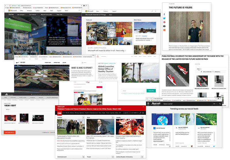
Newsroom Key Takeaways
The analysis was able to uncover examples of well executed design, along with prioritized features to focus on.
Global Design Systems
Navigation: In order to have brand consistency when browsing through any of the UA websites, the mega navigation should be global. Typography should feel consistent through the sites, laddering up to the UA Brand.
Featured Articles / Recommendations
Hierarchy must drive story experience. Featured articles or “most read” lists will improve discovery. Use contextual tagging to drive readers to related stories.
Media Cart
Press benefits from cart functionality to store visual assets Single download experience means the user work flow is uninterrupted.
Images/Video Navigation
A library with a filter/ sort, for visual/video assets so that members of media don’t have to search through specific articles to get what they need quickly.
Social Media
Share: Integrate social media channels into the footer and news articles.
Feed(s): Social Media feeds on home FB, TW, IN (either all or some).
Newsletter Sign Up
Sticky footer notification when entering the site, to sign-up for the newsletter, that in time will allow users to pick and choose what type of news to subscribe for.
Events
Future Events: A calendar to promote future events, that users can attend and even share to friends.
Past Events: Recaps of activation and events with photos/ video and other forms of rich media to drive up brand awareness.
Consider “Microsites”
Named as such can allow for smooth transition from external sites to content incorporated into main site. Can also allow for a centered visitor experience around an important content type.
Observations & Opportunities
This section presents a range of key observations synthesized from Discovery interviews. These are intended to drive the Creative Brief and the overall project execution.
Site Map
After the research phase was completed, the Hiker Team created a site map based on provided content and news stories from UA, along with 4 different evolutions of the Newsroom website, as more content populates the site over time.
Low-fidelity wireframes
Once key points and pain points were uncovered form the research, the next phase was to go into the design studio, and begin drawing out low-fidelity wireframes.


Mid-fidelity wireframes
After refining the low-fidelity wireframes, mid-fidelity wireframes were designed in order to present the structure of the site to both the client and to the development team, so that potential issues and limitations could be brought up early on in the process.
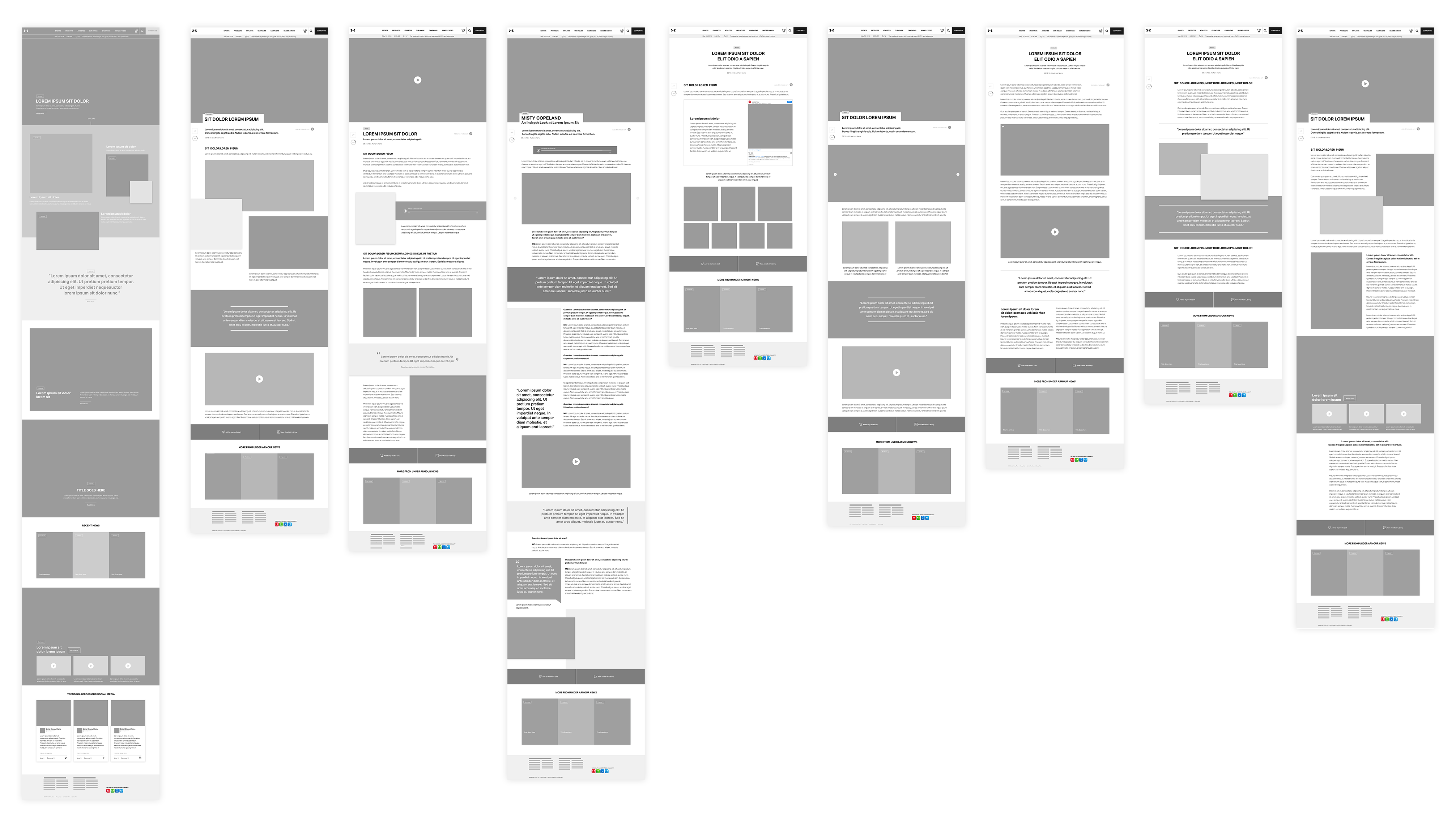
Hi-fidelity wireframes
The hi-fidelity wireframes were very well received by the client. Under Armour felt that the design was visually dynamic and engaging, informative, and easy to customize.
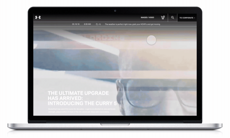
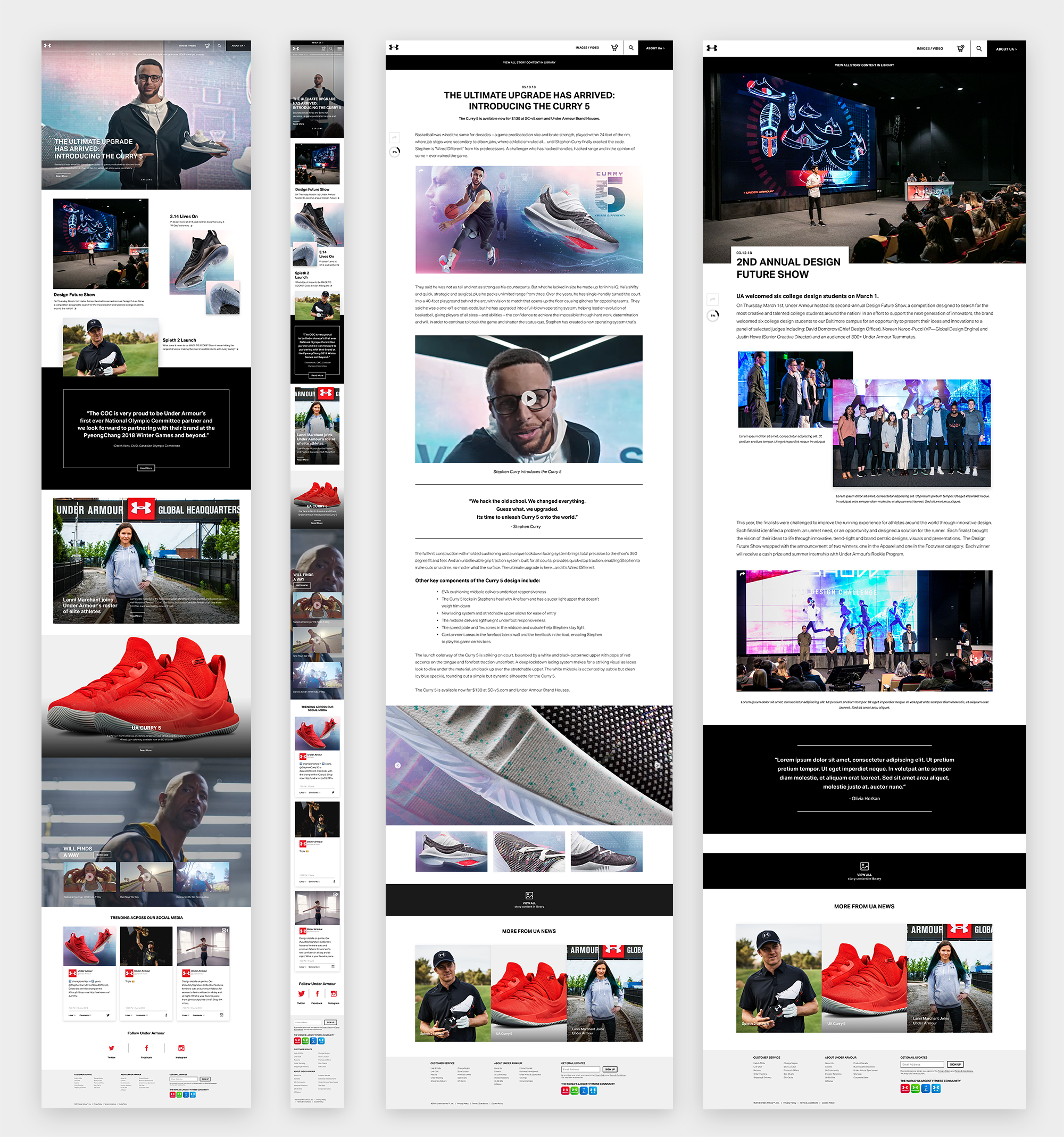
Hi-fidelity mobile wireframes
The hi-fidelity wireframes were also accompanied with mobile designs. Many design issues had to be taken into consideration, mainly how certain modules would adapt to the narrow screen size of a mobile device.
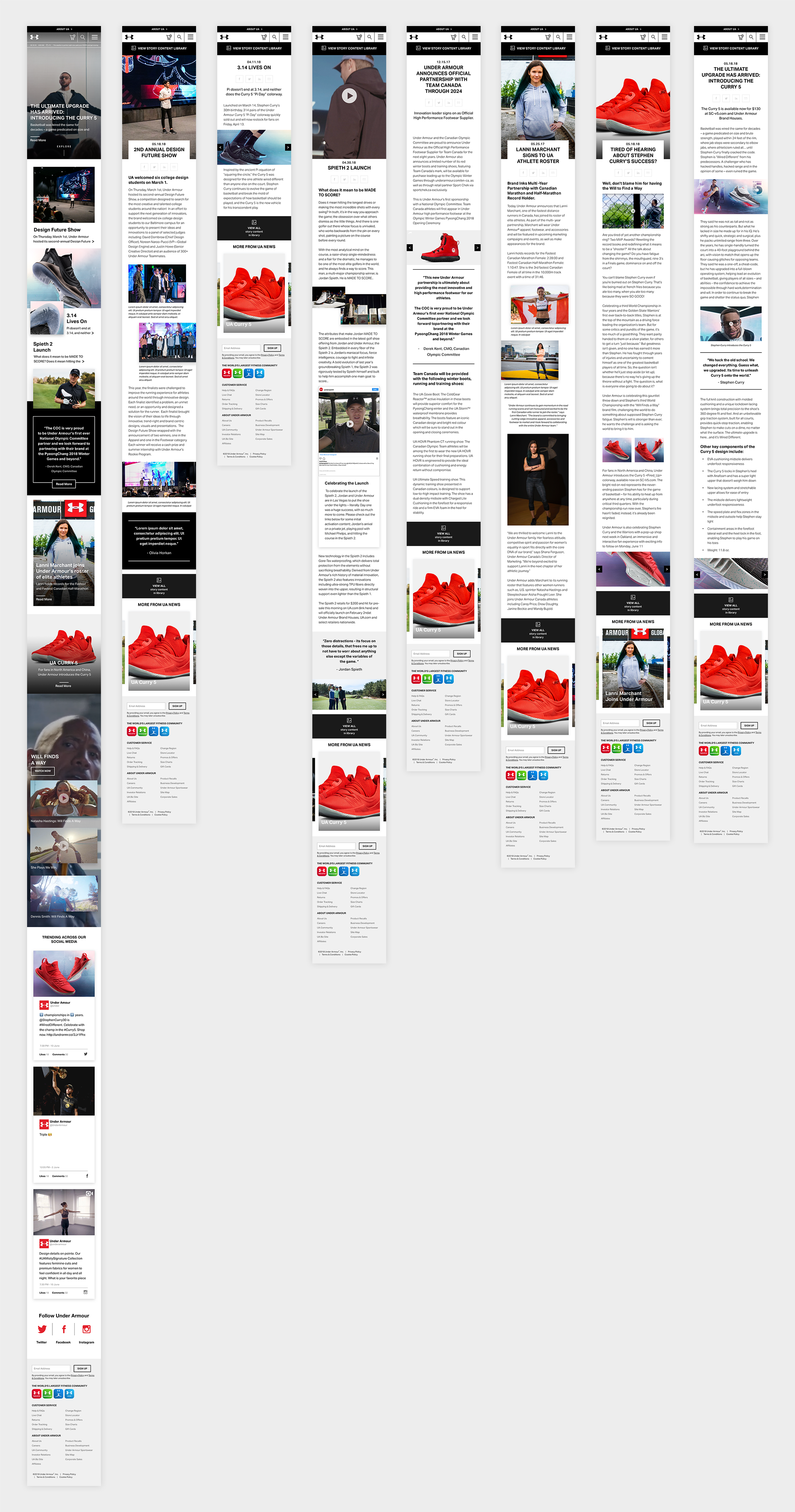
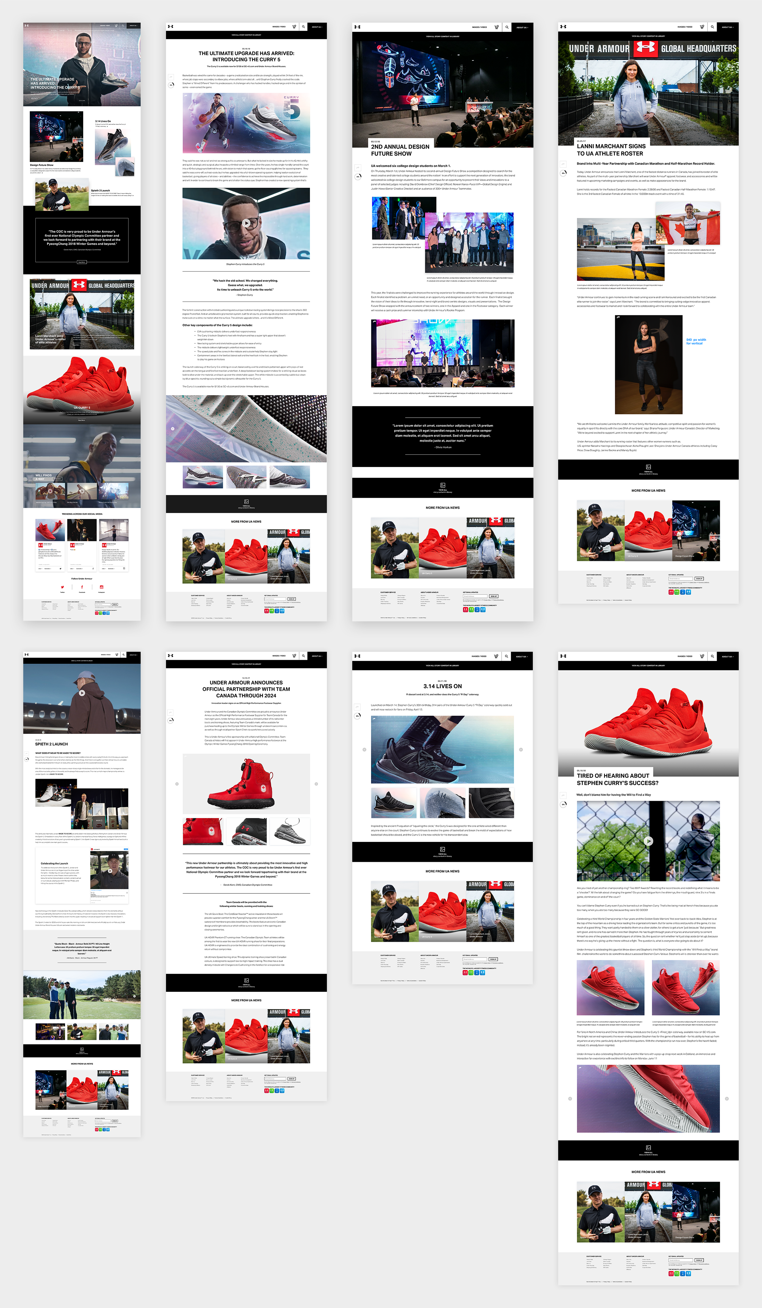
Newsroom Modules
We built templated image and text modules for the Under Armour content team to be able to easily drag and drop their own content when writing new stories and articles.
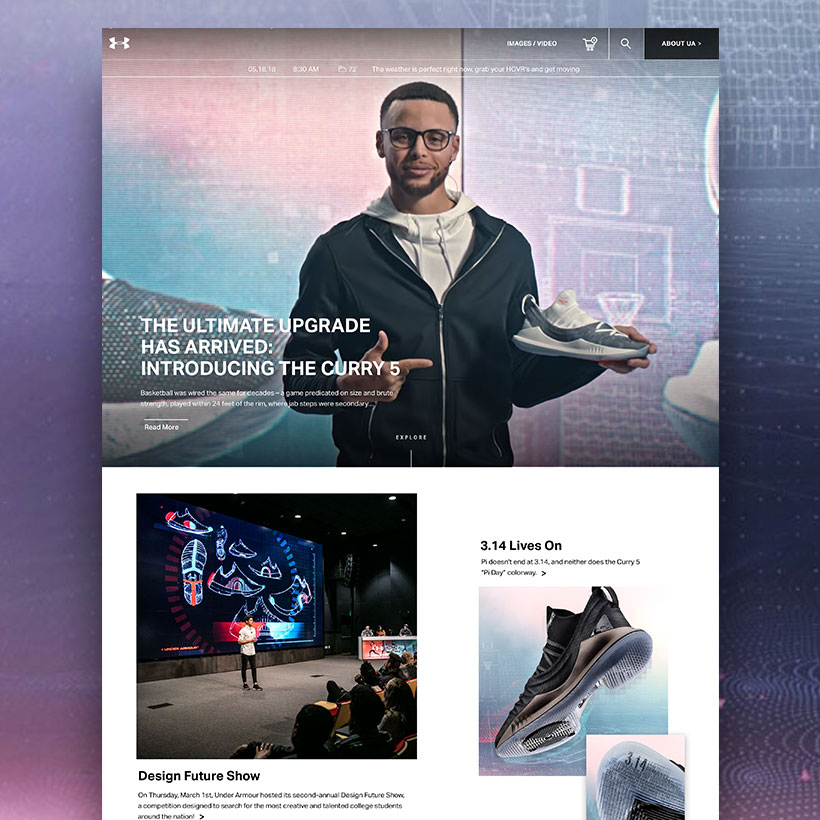
Home Modules
One of the major goals of Under Armour’s Newsroom website,
was to make the site visually dynamic, so a lot of the modules
that we designed for the site, were rich media modules, so that
Under Armour’s videos, and photos could stand out as much
as possible, and minimize the amount of unnecessary text.
Features of the home screen:
– Rich Media Video Module
– Multiple Article Modules
– Video Carousel Module
– Quote Module
– Social Media Modules
– Weather Personalization Feature
– Navigation to go to the Investor Site.
Image/Video Modules


")


")

")
Copy Block Modules


")


Quote Modules


Lead Modules


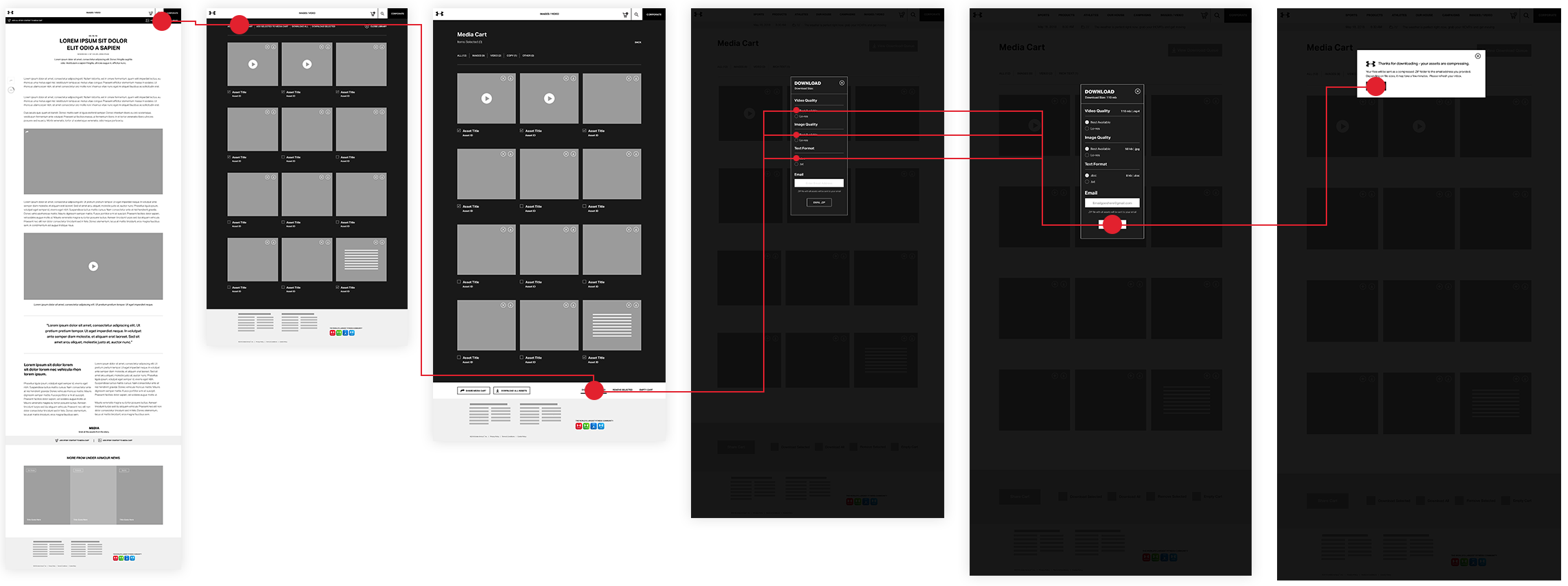
Asset Download Task Flow
The next task was to create a task flow of the the different paths and overall user experience that a site visitor would have, if they were to download media assets from the Newsroom.
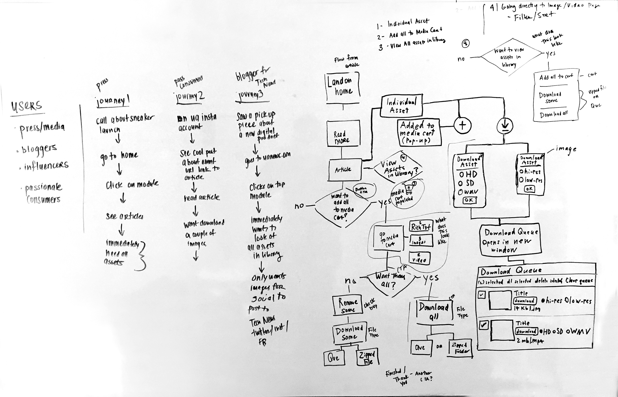
Asset Download Path
The path was an overall success. Users felt like they had multiple options to download needed assets from an article, and mainly felt compelled to view all of the assets from the asset library bar.
Newsroom User Testing Results
Due to time and resources, a majority of our user testing was done through Maze. We had a total of 28 Maze Testers, and 1 in-person user test. We observed how users go to the corporate site from the newsroom, how users search for something specific, and how users navigate back to the newsroom.
User Testing Comments

How do you get to the Corporate site?
There was a 63.6% direct success rate with 7 testers, a 0% indirect success rate with 0 testers, and a Give-up/Bounce rate of 36.4% with 4 testers. Comments mentioned that they could not locate any indicator to go to another site, causing us to design an arrow next to the corporate site CTA, to attract more attention to it, and to indicate that it goes somewhere.
Search for something specific
There was a 66.7% direct success rate with 6 testers, a 33.3% indirect success rate with 3 testers, and a Give-up/Bounce rate of 0% with 0 testers . Not many changes were made, due to the search icon being recognizable, and even if they did not search, they used scrolled down to find what they wanted.
How would you navigate back to Newsroom?
There was a 50% direct success rate with 4 testers, a 12.5% indirect success rate with 1 tester, and a Give-up/Bounce rate of 37.5% with 3 testers . Similar to the first test, users simply had a difficult time recognizing the the CTA at the top right nav, lead to a different site.
Next Steps/Future Opportunities
Next steps will be to continue to QA test the site through Jira, and to slowly build out future pages and features, such as the media cart, and individual category landing pages. Close to 200 design tickets have been submitted through Jira since the MVP launch, and many design changes have been made which include:
- Changing the container width of the article body type to 915 px wide
- Redesigning the asset library bar to be more subtle
- Lowering the overall typeface size of all H2 titles to 20 points
- Moving the weather api bar above the navigation bar