
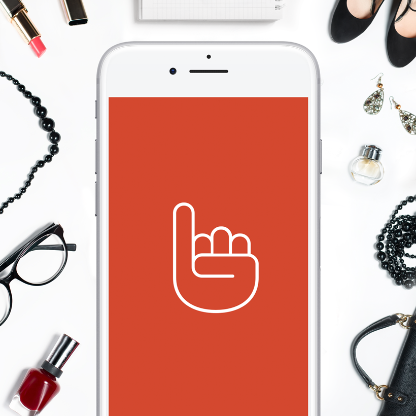
SwearBy
SwearBy
iOS Mobile App
Client
Overview
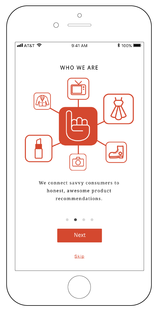
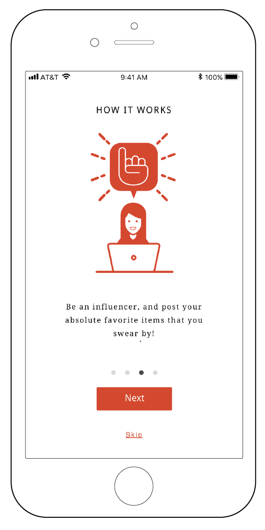
SwearBy helps the world buy only awesome things via
an app and a website that showcases what people swear by.
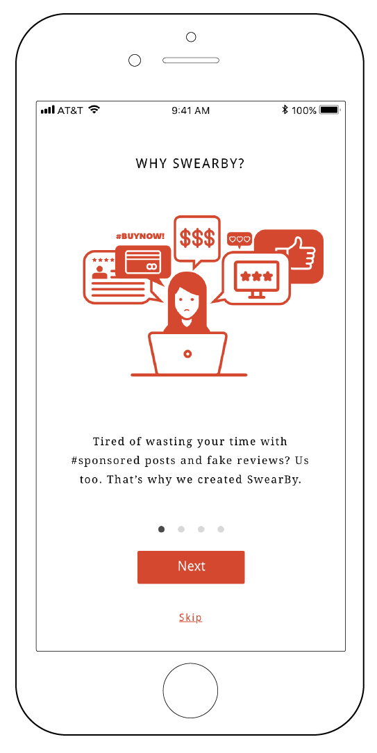
SwearBy is an antidote to the “influencer marketing” craze.
We leverage friends and enthusiasts (not paid bloggers) to
share honest product recommendations that matter.
Team
Justin de los Angeles
Madeleine Bustamante
Kat Gratale
Role
Lead Product Designer
Scrum Leader
Initial Problem
SwearBy introduced out team with three initial problems. We were assigned to connect the mobile app and website experience, connect the mobile app to outside social platforms such as Facebook, and to improve the usability, navigation, and overall design of the existing mobile app interface through extensive user testing and research.
Goal
Our objective was to explore the varying motivations, goals, pain points and needs when it came to recommending and asking for product reviews. We used our discussion guide to freely explore user insights, and used user testing of the existing SwearBy products, to uncover issues related to usability and interactivity.
UX Process and Methods
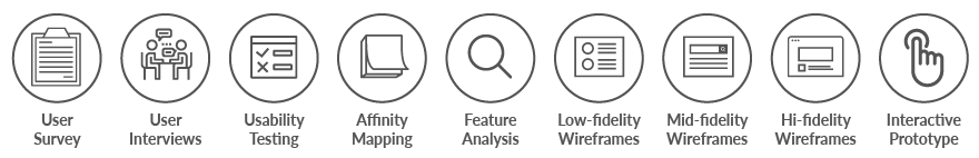

Usability Testing Results
The existing app was evaluated for usability, to see if the user could accomplish the needed tasks to fulfill their goal. Some key evaluations were determining the effectiveness of the discovery and onboarding process, uncover any user expectations of functionality such as faceted navigation, identify preferences regarding onboarding, observing interactions with existing users, and discover how existing users spread the word about SwearBy.

Persona Development and User Interviews
After completing the user interviews, and the usability tests of the existing app, we gathered the data together and created an affinity map. Using the affinity map, we uncovered the major pain points of the user. We uncovered that the major pain points were that users were confused with how to complete certain tasks due to unclear navigation, they were unsure about direction, due to SwearBy lacking an effective onboarding process, and a lack of credentials and customization for product sharing. After the research was synthesized, personas were created in order to humanize the data.
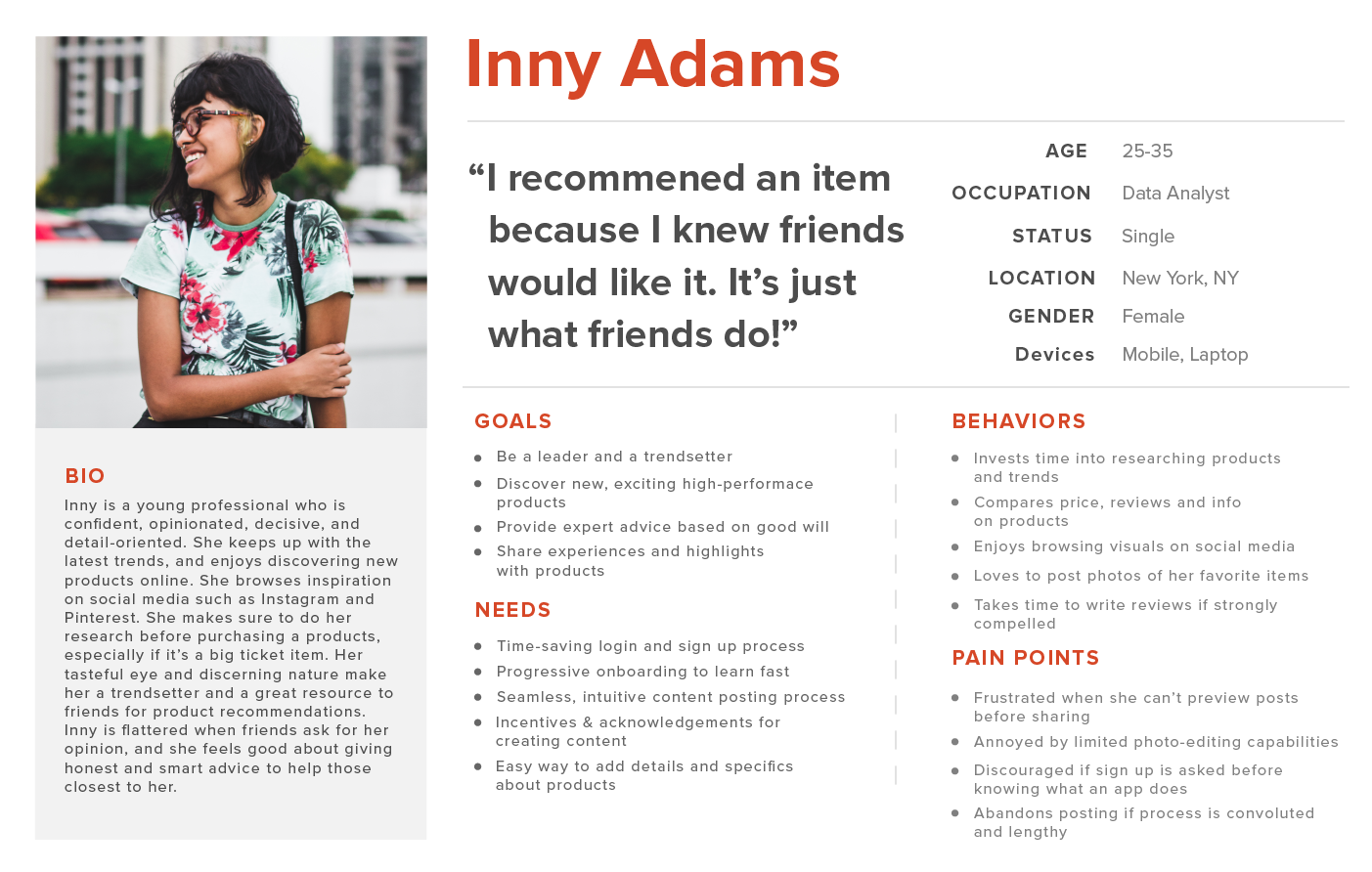
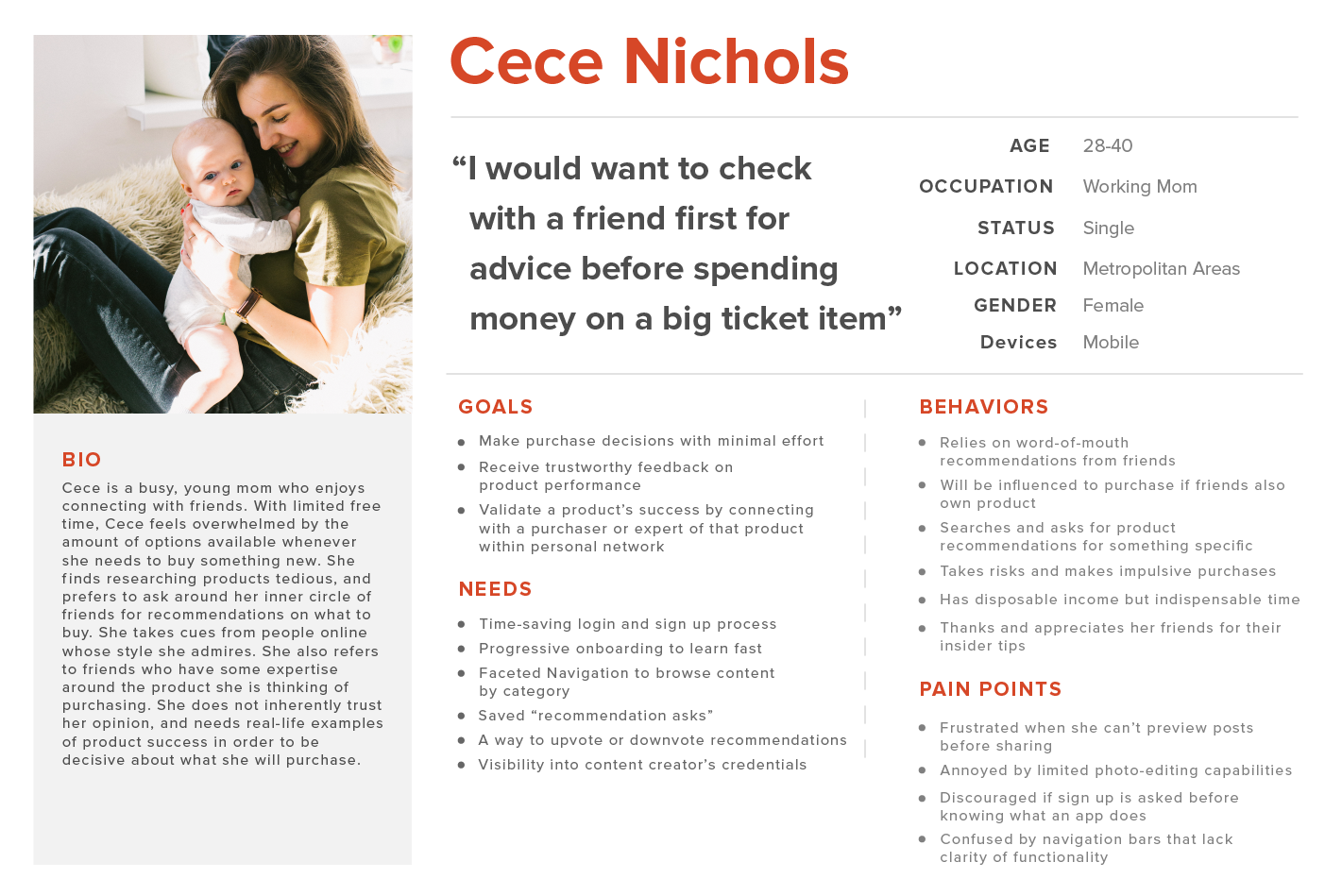
Problem Statement
Authentic influencers like Inny like to share and provide product recommendations, while influence seekers like CeCe enjoy consuming this content. However, barriers to entry, limited navigability, and challenging content creation processes discourage users from engaging with SwearBy. How might we redesign SwearBy’s interface to facilitate continuous content creation and consumption?
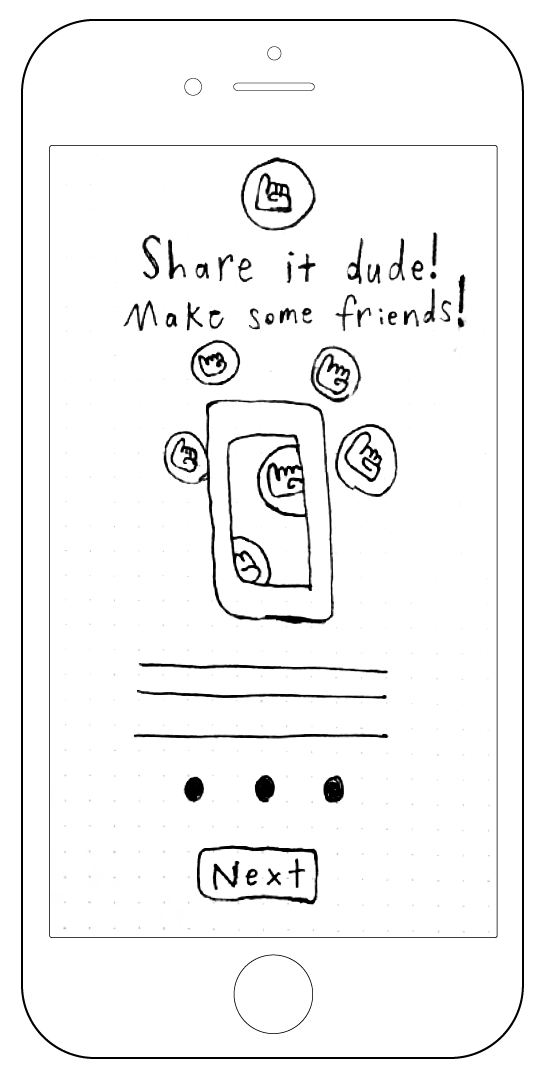
Low-fidelity wireframes
After creating the personas and creating a feature prioritization map using the MoSCoW method, we began a design studio as a team, in order to conceptualize and sketch out possible solutions to our users’ pain points.
Task Scenarios/Task Flow
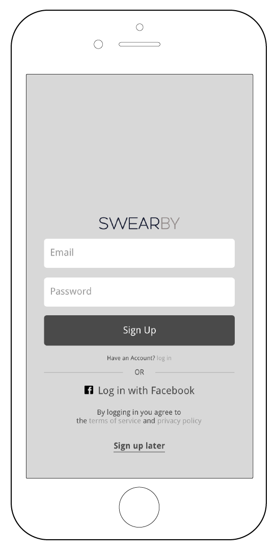
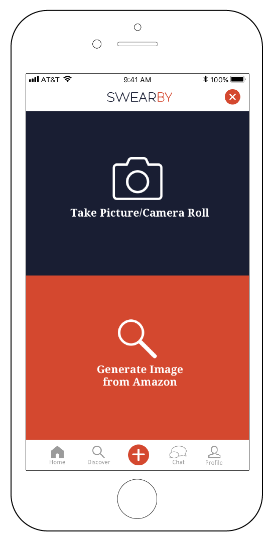
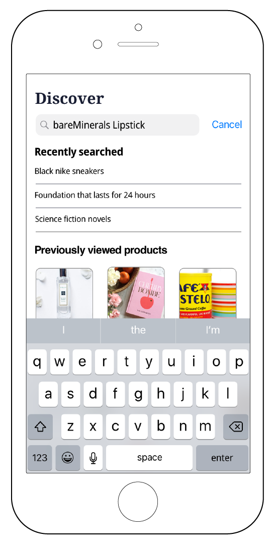
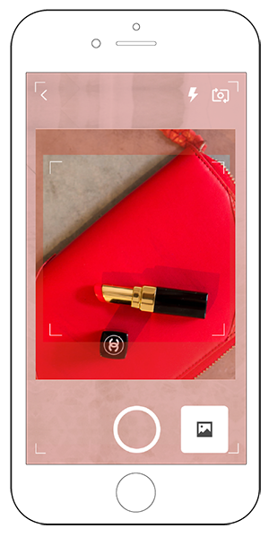
The first task scenario that we created for the users, was to sign up to SwearBy, and then recommend a product that you want to swear by. The second task scenario that we created, was to ask for a product recommendation.

Mid-fidelity wireframes
After a solution was decided on, mid-fidelity wireframes were designed, in order to run usability tests on the updated interface.
Round 2 Usability Test Results
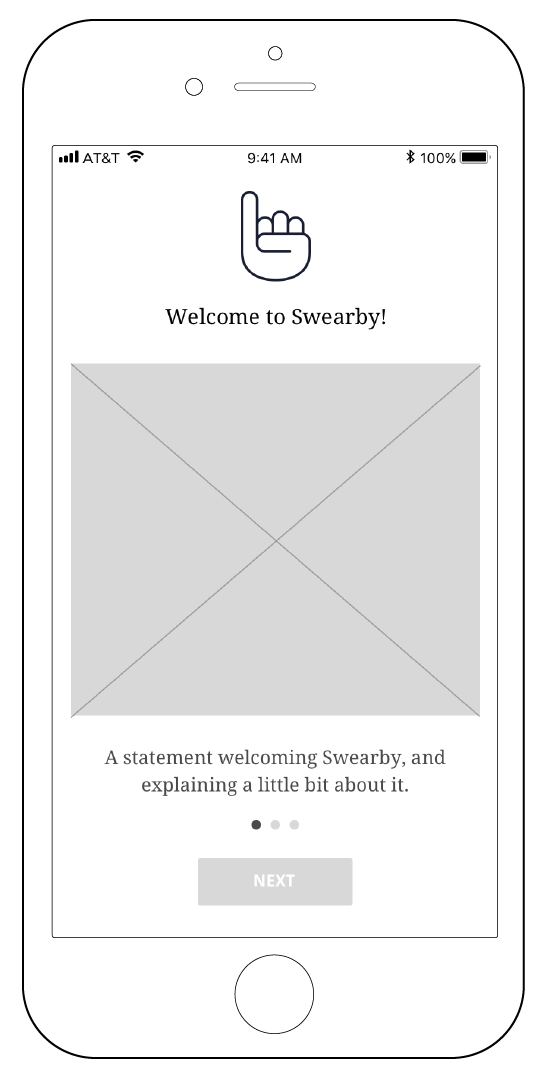
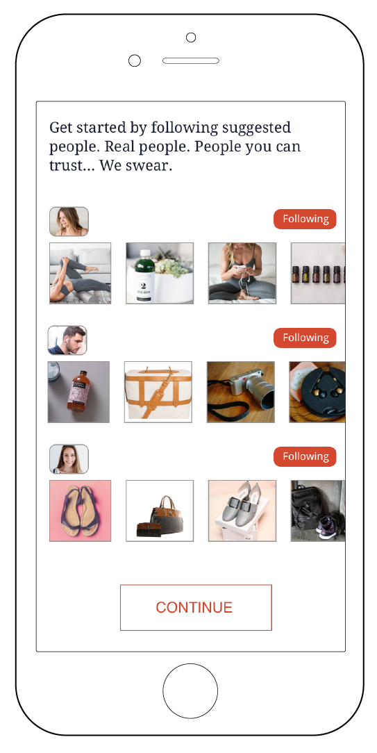
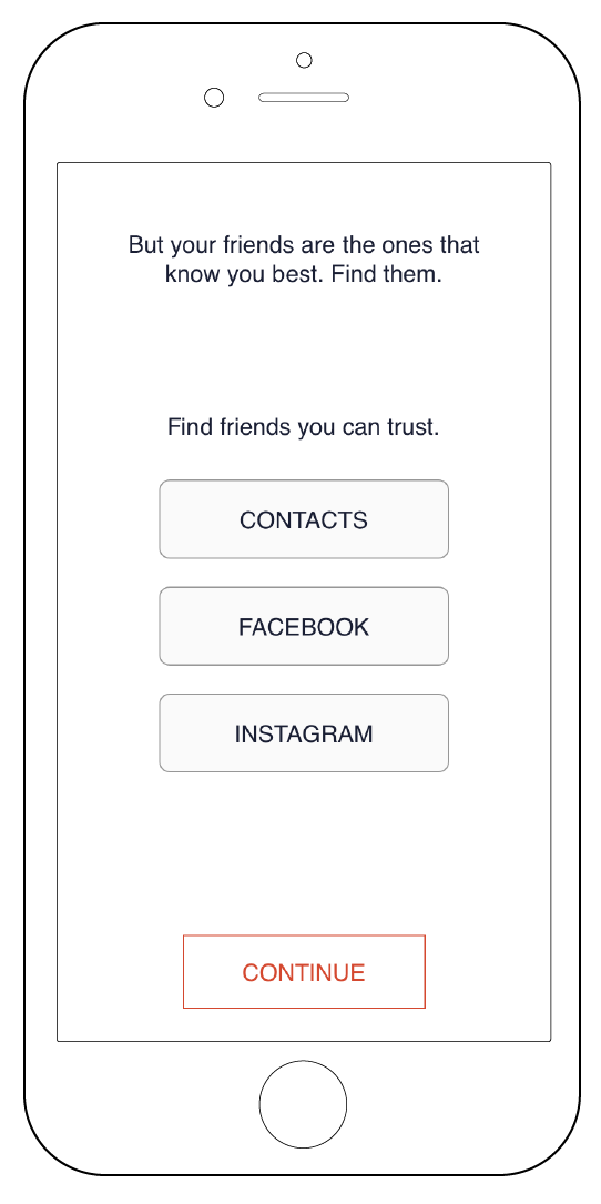
The navigation for the updated interface felt incredibly intuitive to the user, especially in regards to the first task scenario. Users also felt that having an onboarding process at the start of the app, was key to understanding the purpose of SwearBy. A majority of issues still remained within the “ask” section, and how it could be effectively and intuitively used by the user.

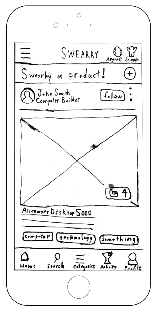
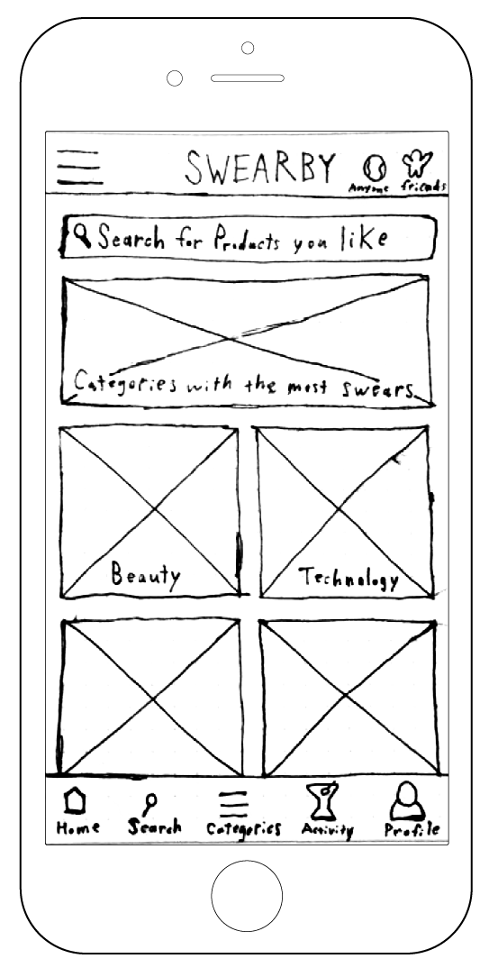
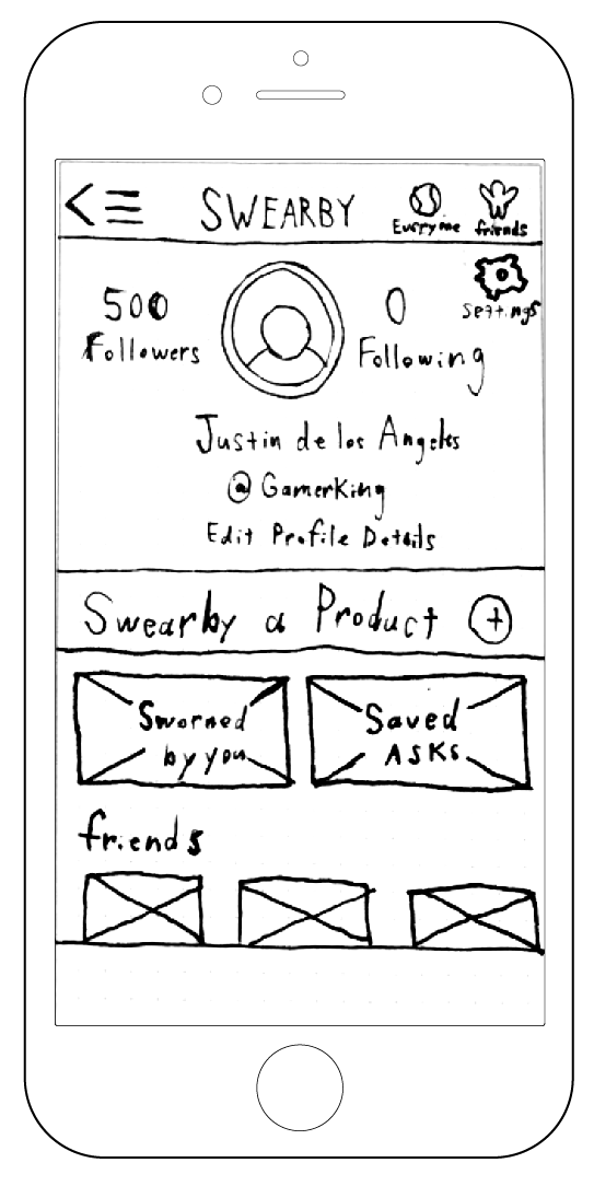
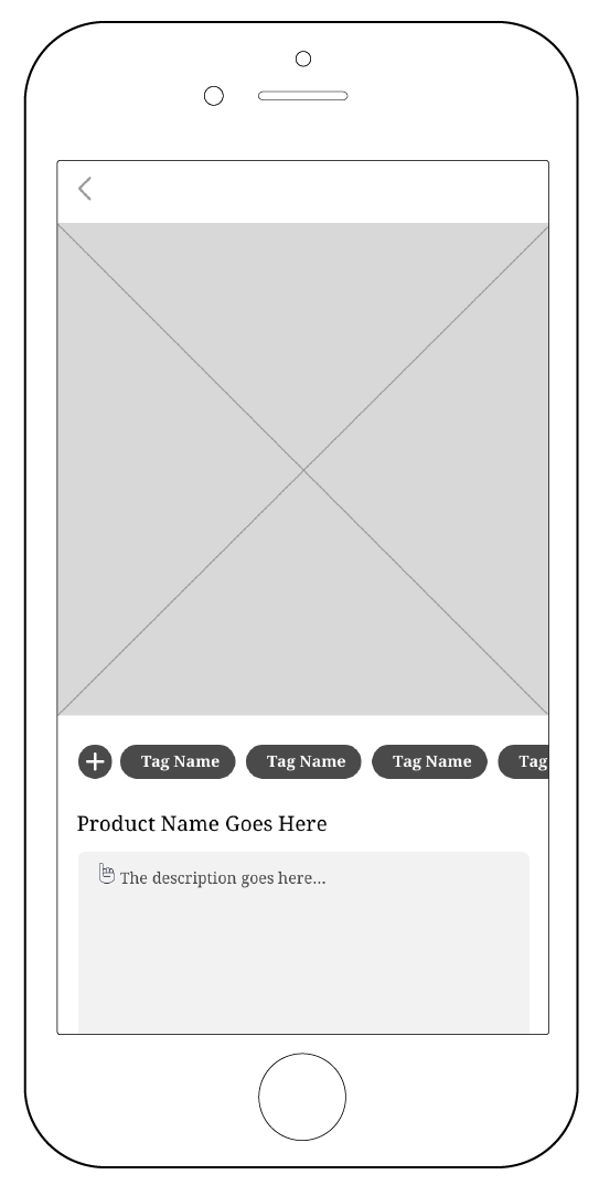
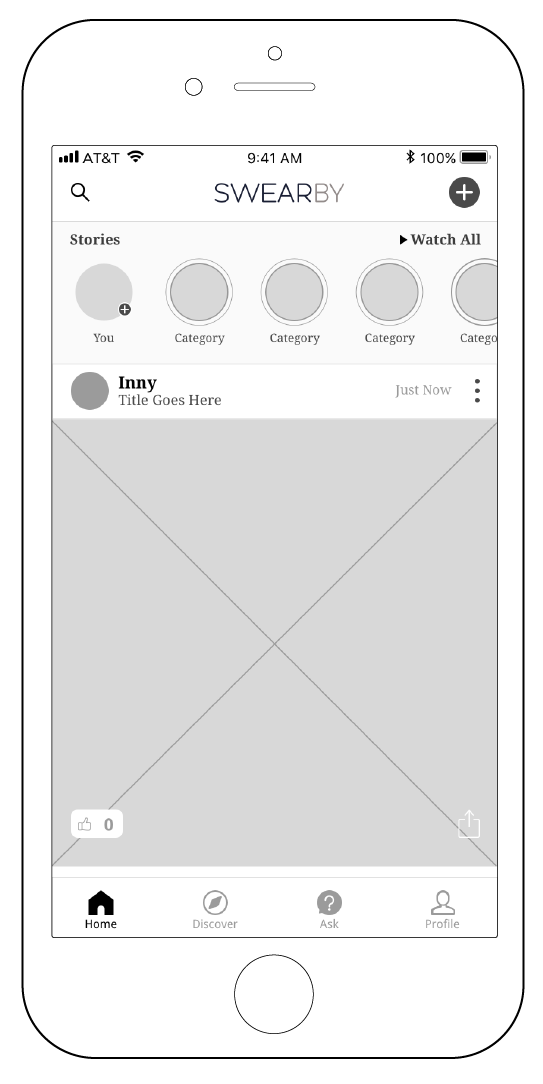
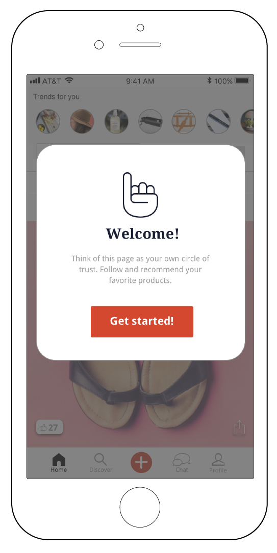
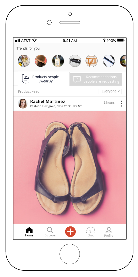
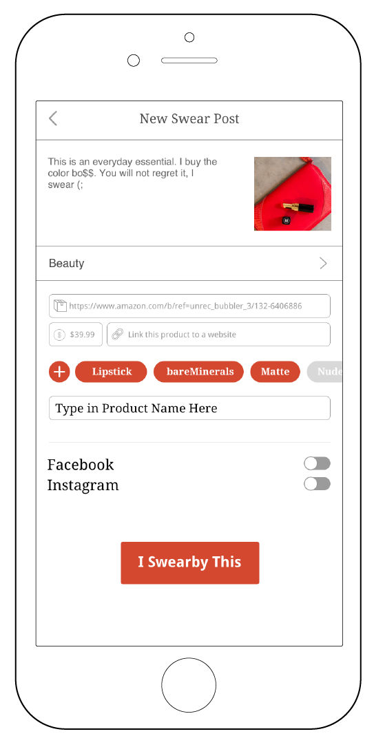
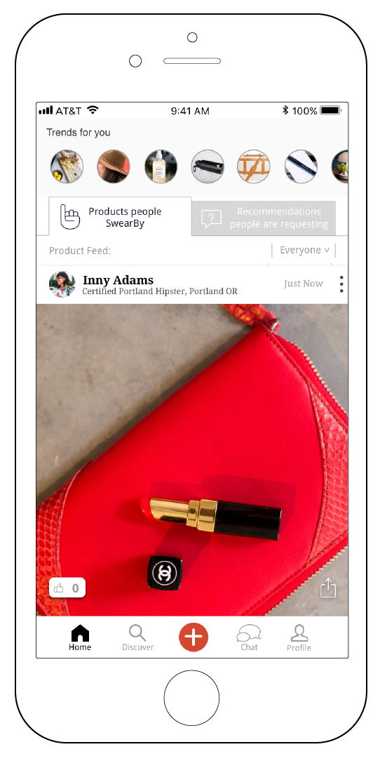
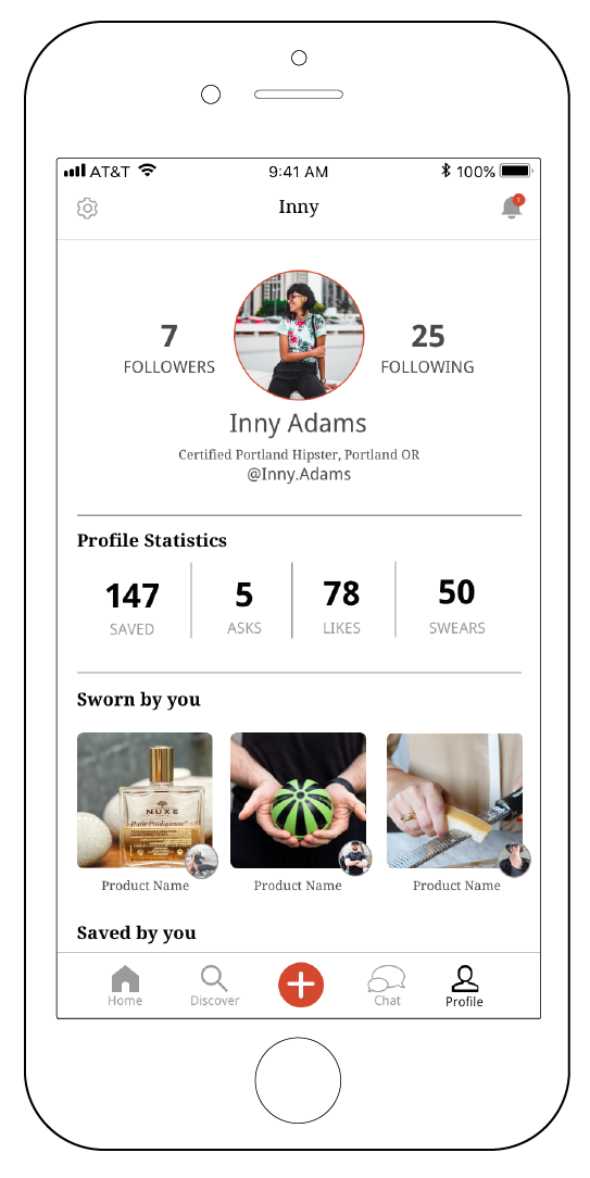
Hi-fidelity wireframes
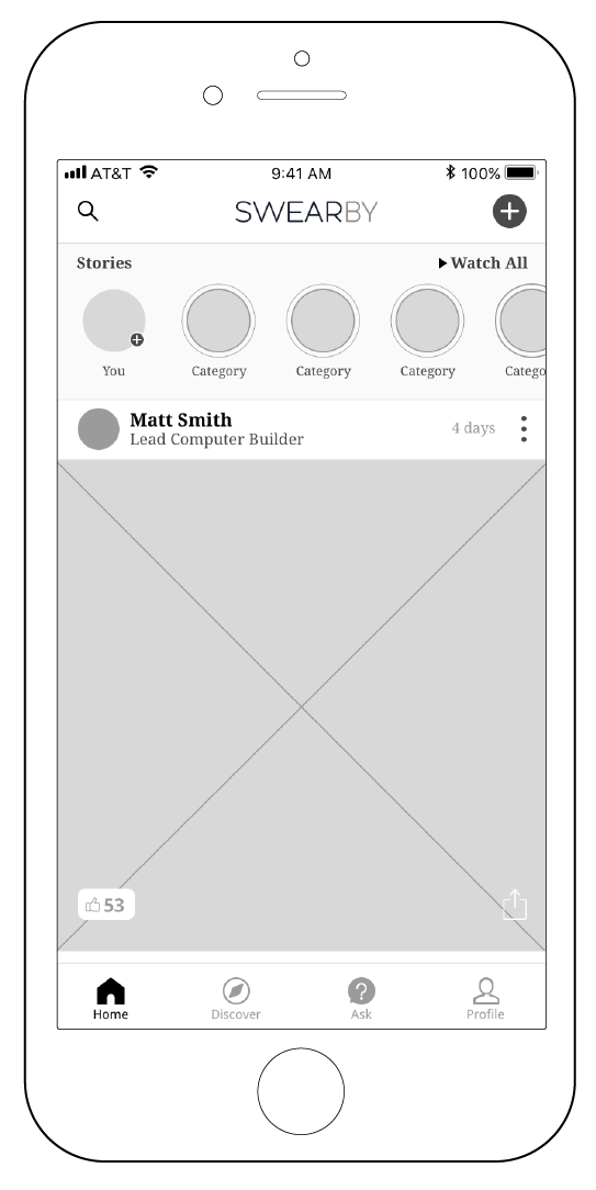
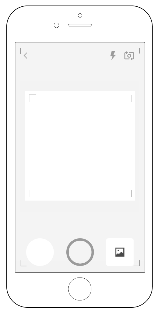
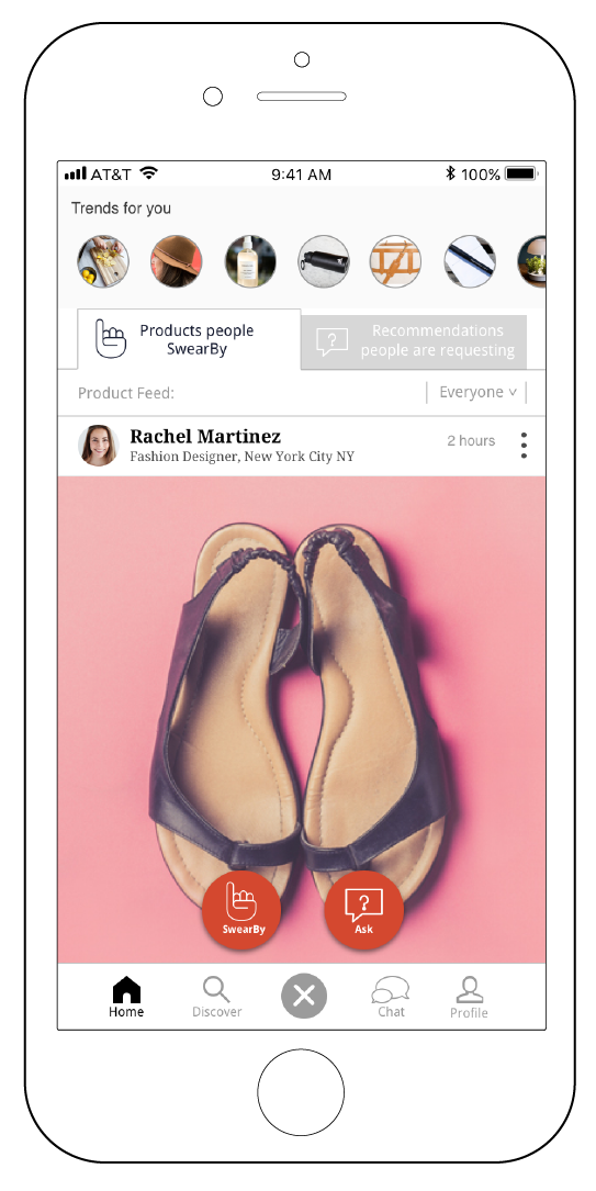
The hi-fidelity wireframes had a tremendous success rate, with 4 out of 5 people, able to successfully complete both task scenarios without issue. The new navigation elements such as the “+” call to action button, and the new home feed interface, which included the ability to swear by a product, and ask for a recommendation, made both task scenarios far more intuitive to the user.

Next Steps/Future Opportunities
Next steps will be to continue to test the two task scenarios, specifically the home screen, in order to lock down and maximize the effectiveness of SwearBy’s navigation. Future opportunities that we want to delve into, are figuring out ways to create motivation for recurring activity within the app, such as integrating a reward or gamification system, along with increasing social reach and engagement within the app. Some ways that we want to increase social engagement, are by continuing to build out the discover screen for users to find new products and content creators, along with finding ways to connect the app to SwearBy’s website and other outside social media platforms such as Facebook.